
MUSIC IN HOSPICES
Music in Hospices wanted to evolve beyond the perception of a traditional charity and commissioned Yuma Studios to create a visual identity that would:
Reposition the organisation
Build stronger emotional connections with new audiences
Increase recognition and consistency across every touchpoint
Create a flexible visual system capable of supporting future campaigns, partnerships and organisational growth
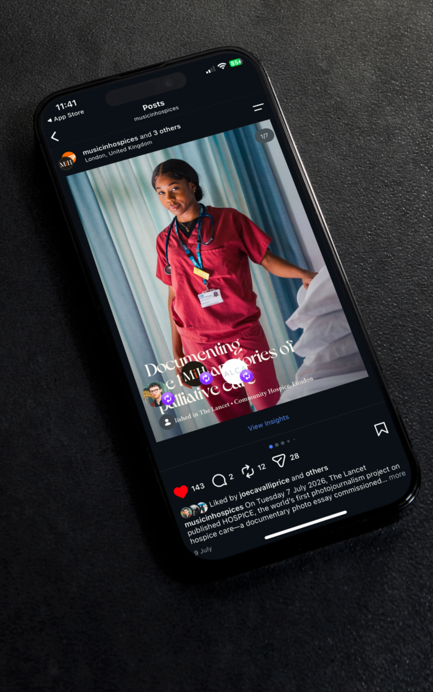
The project focused on four key objectives:
Establish a distinctive and recognisable visual identity
Create a cohesive design system that could be applied consistently across digital and print
Produce practical, ready-to-use assets for internal teams
Build a scalable brand foundation to support future marketing, fundraising and communications
We created a visual language that feels positive, human and instantly recognisable while remaining sensitive to the subject of palliative care.
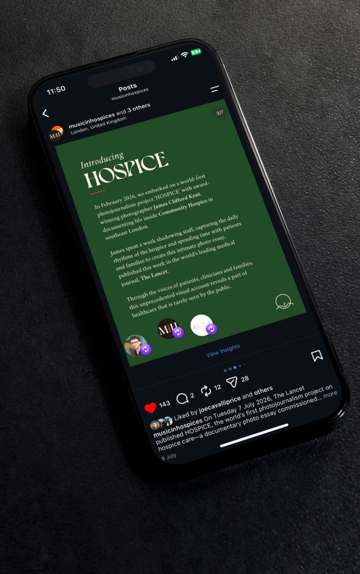
At the centre of the identity is a flexible logo system designed to adapt across different colourways along with a suite of supporting visual assets:
Contemporary typography system that supports storytelling and clear communication across digital and printed materials
Refreshed colour palette helping the organisation feel more approachable and emotionally engaging, yet still sophisticated
Bespoke icon system centred around the organisation’s visual language, providing an additional storytelling layer across every platform
Suite of branded social media templates that enable the team to produce high-quality content quickly and consistently
Comprehensive brand book providing a single source of truth for the organisation’s visual identity
Bespoke brochure communicating MiH’s mission, programmes and impact through a carefully considered editorial layout and visual storytelling approach
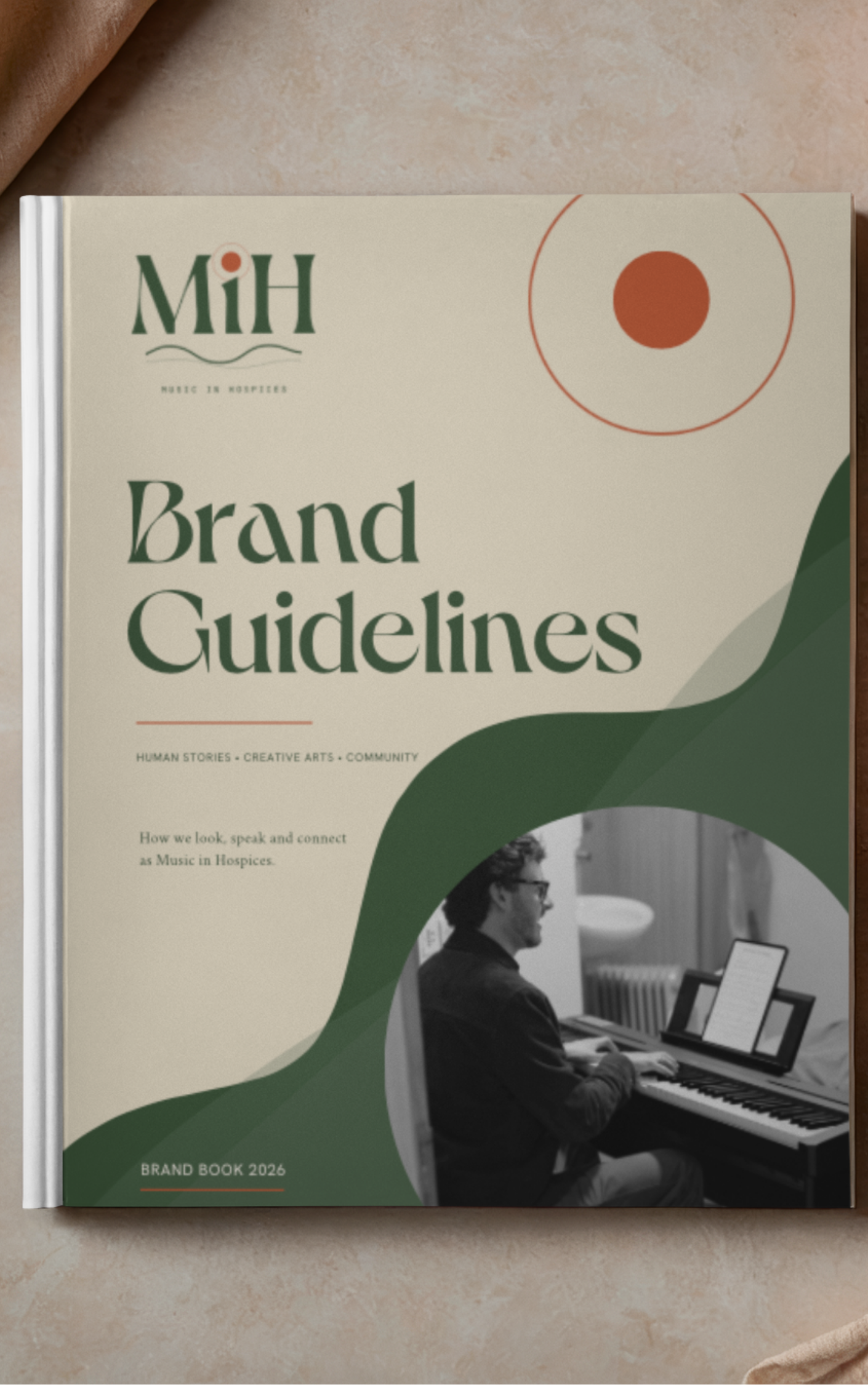
The project provided Music in Hospices with a scalable brand system that supports long-term growth, strengthens recognition and gives the team the tools to communicate consistently across every channel.
With practical assets, clear brand guidance and flexible communication templates, the organisation is now better equipped to engage new audiences, build partnerships and continue reshaping public perceptions around palliative care.
The result is a brand that feels less like a healthcare organisation and more like a cultural movement built around shared stories and lived experiences.